
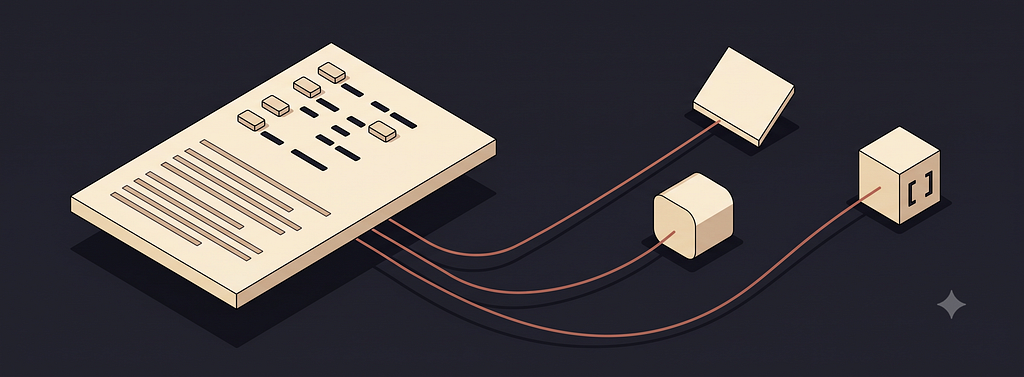
Like a mullet, the business is up top for the machine, and the party below for the person. A single file is the standard we need that both your team and your agents read as truth.
Ask a coding agent to build a screen today and watch what it reaches for: Some gray Material button, a shadcn card, a stack of defaults that belong to no brand in particular.
That is not the agent failing: It is the agent working from nothing, because your visual identity lives in Figma files, a slide deck, and the heads of three senior designers, none of which a model can read at build time.
Without a written source of truth, agents fall back to generic components regardless of your brand. Literally, any components it can find.
The fix is one plain-text file, checked into the repository, that states your design two ways at once: machine-readable tokens up top, human-readable rationale below.
In April 2026, Google Labs made the DESIGN.md format open source. This is the start of agent standards, the plain-text files a model reads as contracts: README.md for how code runs, DESIGN.md for how a brand looks.
Design.md is the beginning of designing with web standards for the AI moment. L. Jeffrey Zeldman set the example, and now the agents are following.
This piece walks you through writing your own, from the first color token to the audit you run against your live site. A chat window and a brand you know are enough to start.

One File, Two Readers
The file does one thing: It states your design in a form both a person and a machine can read, in the same place, at the same time.
DESIGN.md combines machine-readable tokens — your colors, type scale, spacing, and radii — with human-readable prose that explains what those values mean and when to bend them.
The tokens give an agent exact numbers and the prose gives it judgment.
Watch the difference on a single request.
- Without a design.md file, ask an agent for a primary button with no file in play and you get a blue-gray rectangle at some default radius, correct and anonymous.
- With a deisgn.md file, the same request returns your deep forest green at your exact corner radius, because the token supplied the value and the prose supplied the intent.
One breakdown of the format puts it plainly: the tokens tell an agent what, the prose tells it why, and it needs both to make any non-trivial call. Strip that away and it reaches for generic components no matter whose brand it is building.
There are eight body sections, and those that are present should appear in this order:
- Overview (also “Brand & Style”) — a holistic description of the product’s look and feel: brand personality, target audience, and the emotional response the UI should evoke, used as context when a specific token isn’t defined.
- Colors — the color palettes; at least the primary palette must be defined, with additional palettes as needed.
- Typography — the type levels; most systems have 9 to 15, named with semantic categories like headline, display, body, and label.
- Layout (also “Layout & Spacing”) — the layout and spacing strategy, such as a grid model and a spacing scale; the spacing tokens live here.
- Elevation & Depth (also “Elevation”) — how visual hierarchy is conveyed, whether through shadows or, for flat designs, alternatives like borders and color contrast.
- Shapes — how elements are shaped; the rounded-corner tokens live here.
- Components — style guidance for component atoms like buttons, chips, lists, inputs, and checkboxes, plus their component tokens.
- Do’s and Don’ts — practical guardrails and common pitfalls, like using the primary color for only the single most important action per screen.
That second half is the part most teams skip, and it is the part that carries the weight. A stylesheet already has your hex values; what it does not have is the reasoning.
- Why the primary is a deep forest green.
- What “one action per screen” means for your buttons.
- When a designer is allowed to break the grid.
Think of it the way engineering thinks about README.md. Nobody argues anymore about whether a repository should explain itself. The file that does it sits at the root, and every new engineer, and now every agent, reads it first. DESIGN.md is that file for your brand, and the prose half is where the brand truly lives.
The Anatomy: Tokens Up Top, Prose Below
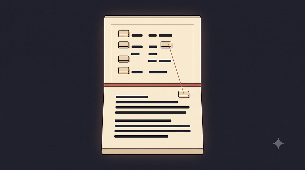
Open a DESIGN.md and you find two zones. Up top, fenced off, sits YAML frontmatter: typed groups for colors, typography, spacing, rounded corners, and components. Below the fence, Markdown prose, written in a fixed order that opens with Overview and closes with a short list of do’s and don’ts.
Google’s own Paws & Paths example shows the shape in a few lines:
---
colors:
  primary: "#855300"     # "Golden Retriever" — main actions
  secondary: "#0058be"   # "Sky Walk" — calmer, admin tasks
typography:
  body-md: { fontFamily: Plus Jakarta Sans, fontSize: 16px }
---
## Colors
The palette centers on "Golden Retriever" orange to drive
action, balanced by "Sky Walk" blue for scheduling and admin.
Typed values sit above the fence, plain reasoning sits below it, and a component reference like {colors.primary} ties the two together, so a color is defined once and pointed at everywhere.
The structure is fixed; the personality is not. Google’s atmospheric-glass example fills the same sections with a glassmorphism weather app — frosted crystalline panels, a 20-pixel blur, a white palette floating over vibrant gradients — where Paws & Paths reads friendly, rounded, and professional. Same eight headings, opposite moods. That range is the point: the format carries a brand’s character, not just its numbers.
The specification treats that structure as part of the contract. An unknown section heading is preserved rather than rejected. An unknown token is accepted as long as its value is valid.
But a duplicate section heading is an error that rejects the whole file, which tells you the order and the uniqueness of sections are load-bearing, not decoration.
Tokens are declared with intent, so when the prose and the tokens disagree, the tokens win.
Two mechanics are worth learning early. Tokens are normative, so when the prose and the tokens disagree, the tokens win.
A value defined once can be reused by reference: in Paws & Paths, the primary button reads backgroundColor {colors.primary}, rounded {rounded.lg}, padding {spacing.md}, so its look is never a hex code, only a set of pointers. Rebrand, and that is a one-line change rather than a search across forty files.

Write Your First File in a Chat Window
You do not need a repository to start. Open whatever assistant you already have, hand it an example DESIGN.md, and ask it to interview you about your brand — your core colors and what each one should signal, two or three type levels, the corner radius that feels right. Then have it format your answers into the same structure and paste the result into a plain-text file. That is a working draft, and it took a conversation.
A starting prompt can be this short:
Here's an example DESIGN.md. Interview me about my brand —
colors and what each should signal, two or three type levels,
the corner radius that feels right — then write mine in the
same format.
Writing both halves is the discipline. Skip the prose and you have a palette; write the prose and you have a brief.
So begin with a brand that has an opinion — your product, a client, a site you admire — where the decisions are real rather than invented. Draft the tokens first: the primary, secondary, tertiary, and neutral, plus two or three type levels. Only then write the short Overview and Colors sections that explain what those values are for.
Skip the prose and you have a palette; write the prose and you have a brief.
When the draft feels close, test it. Paste the file into an agent, ask for a single sample screen, and watch the one place it guesses. That gap is your next token to define.
Name Tokens and Components by Role
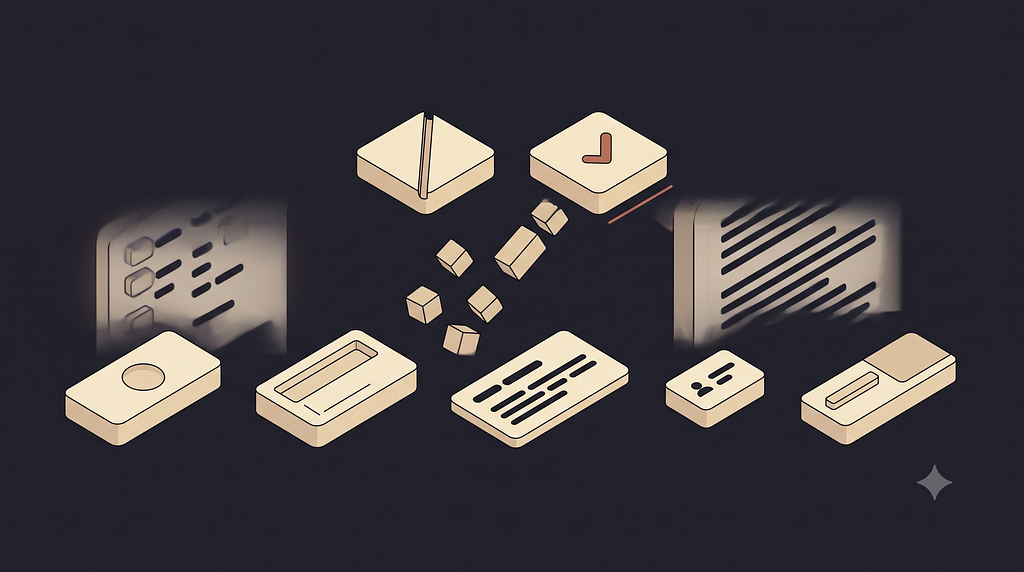
Name things by what they do, not what they look like. A token called bigRedButton breaks the moment you rebrand, while a token called button.primary survives any visual change, because the role outlasts the color. The same holds for components.
Borrow the vocabulary every tool already knows — button, input, card, badge, tabs — rather than inventing a private dictionary an agent has to guess at.
Name things by what they do, not what they look like.
This is old wisdom wearing new clothes.
- Brad Frost’s Atomic Design argued years ago that the way things are named shapes how they are understood and reused, and that a shared component language beats a bespoke one every time.
- Christine Vallaure makes a parallel case in Design system contracts. Put a small, plain description of each component in the middle, one the design tool and the code both read, so the component lives in neither Figma nor the codebase but in the shared file.
- If you want a reference for how the same element is named across popular design systems, UX Components maps them side by side — a faster way to pick names than arguing about them from scratch.
Where the File Lives, and How It Stays Honest
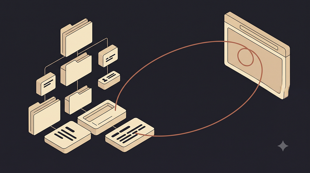
Put the file where the rest of your source lives: at the repository root, or in a /docs folder, named DESIGN.md, sitting beside README.md. Now every change to your design has an author and a diff, reviewed like any other pull request. That alone is a quiet upgrade over a design system that lives in a tool only designers can open.
The file also becomes something you can run. Google’s format ships command-line tooling that lints, diffs, and exports: the linter checks token references and flags color pairs that fail WCAG contrast ratios, the diff surfaces token and prose regressions between two versions, and the exporter converts your tokens into a Tailwind configuration or a W3C design-token format for other toolchains.
The findings come back as structured data an agent can act on. The documented example flags a button’s white text on a deep-ink background at a 15.42:1 contrast ratio, comfortably past the WCAG AA threshold — a review that used to happen by eye, now part of the build.
The two-way check is what keeps the file alive.
The most useful habit needs no tooling at all. Point an assistant at your file and your live site, then ask where they disagree. Sometimes the site is wrong, and sometimes the file is stale.
A source of truth nobody reconciles quietly becomes fiction.
The Standard Is Not Here Yet, but the Move Is
None of this requires you to bet on one company’s tooling. The format is young, an alpha specification with plenty the project is still working through in the open — dark mode, motion, and responsive breakpoints among the unsettled questions — and real adoption depends on whether the tools designers already use decide to read and write it.
That may take a while, but the underlying move is not speculative.
Design has always drifted the moment it left the designer’s hands, kept as tribal knowledge and half-remembered rules.
Writing it down in a form both people and machines can read is the fix, whether or not this specific file becomes the standard and in the agent era, the teams that do well are the ones whose brand is legible to what builds it, not locked in a tool few can open.
You need not wait for a committee to learn a format:
- Pick a brand you know.
- Write a frontmatter block with a palette and two or three type tokens. Add a short Overview and a Colors section mapping names to meaning.
- Paste it into an agent and watch where it still guesses.
That gap is where your next hour goes.
Resources
- DESIGN.md examples — real example files from Google Labs to model your own on, spanning a few different brand personalities.
- DESIGN.md Explained — a product-team read on what the format changes in practice, with hands-on examples across tools like Cursor and Stitch.
- Prompts for Claude Code You Should Run on Your Application — @usabilitycounts on building and maintaining a real application with an agent, from the maker of the UX Components reference.
- The frontend-design DESIGN.md proposal — a look at how one AI tool is wiring the format into its own build workflow, an early sign of the adoption this piece’s close depends on.

Design.md: the one standard file carries your visual identity, for humans and agents was originally published in UX Collective on Medium, where people are continuing the conversation by highlighting and responding to this story.
A single plain-text file open on a dark screen, its top half typed values and its bottom half written sentences, feeding outward to a design tool, a code editor, and a coding agent.Like a mullet, the business is up top for the machine, and the party below for the person. A single file is the standard we need that both your team and your agents read as truth.Ask a coding agent to build a screen today and watch what it reaches for: Some gray Material button, a shadcn card, a stack of defaults that belong to no brand in particular.That is not the agent failing: It is the agent working from nothing, because your visual identity lives in Figma files, a slide deck, and the heads of three senior designers, none of which a model can read at build time.Without a written source of truth, agents fall back to generic components regardless of your brand. Literally, any components it can find.The fix is one plain-text file, checked into the repository, that states your design two ways at once: machine-readable tokens up top, human-readable rationale below.In April 2026, Google Labs made the DESIGN.md format open source. This is the start of agent standards, the plain-text files a model reads as contracts: README.md for how code runs, DESIGN.md for how a brand looks.Design.md is the beginning of designing with web standards for the AI moment. L. Jeffrey Zeldman set the example, and now the agents are following.This piece walks you through writing your own, from the first color token to the audit you run against your live site. A chat window and a brand you know are enough to start.A person reads the rationale while an agent reads the tokens — both looking at the same document between them.One File, Two ReadersThe file does one thing: It states your design in a form both a person and a machine can read, in the same place, at the same time.DESIGN.md combines machine-readable tokens — your colors, type scale, spacing, and radii — with human-readable prose that explains what those values mean and when to bend them.The tokens give an agent exact numbers and the prose gives it judgment.Watch the difference on a single request.Without a design.md file, ask an agent for a primary button with no file in play and you get a blue-gray rectangle at some default radius, correct and anonymous.With a deisgn.md file, the same request returns your deep forest green at your exact corner radius, because the token supplied the value and the prose supplied the intent.One breakdown of the format puts it plainly: the tokens tell an agent what, the prose tells it why, and it needs both to make any non-trivial call. Strip that away and it reaches for generic components no matter whose brand it is building.There are eight body sections, and those that are present should appear in this order:Overview (also “Brand & Style”) — a holistic description of the product’s look and feel: brand personality, target audience, and the emotional response the UI should evoke, used as context when a specific token isn’t defined.Colors — the color palettes; at least the primary palette must be defined, with additional palettes as needed.Typography — the type levels; most systems have 9 to 15, named with semantic categories like headline, display, body, and label.Layout (also “Layout & Spacing”) — the layout and spacing strategy, such as a grid model and a spacing scale; the spacing tokens live here.Elevation & Depth (also “Elevation”) — how visual hierarchy is conveyed, whether through shadows or, for flat designs, alternatives like borders and color contrast.Shapes — how elements are shaped; the rounded-corner tokens live here.Components — style guidance for component atoms like buttons, chips, lists, inputs, and checkboxes, plus their component tokens.Do’s and Don’ts — practical guardrails and common pitfalls, like using the primary color for only the single most important action per screen.That second half is the part most teams skip, and it is the part that carries the weight. A stylesheet already has your hex values; what it does not have is the reasoning.Why the primary is a deep forest green.What “one action per screen” means for your buttons.When a designer is allowed to break the grid.Think of it the way engineering thinks about README.md. Nobody argues anymore about whether a repository should explain itself. The file that does it sits at the root, and every new engineer, and now every agent, reads it first. DESIGN.md is that file for your brand, and the prose half is where the brand truly lives.One document, two zones — structured typed values above the seam, flowing written rationale below it.The Anatomy: Tokens Up Top, Prose BelowOpen a DESIGN.md and you find two zones. Up top, fenced off, sits YAML frontmatter: typed groups for colors, typography, spacing, rounded corners, and components. Below the fence, Markdown prose, written in a fixed order that opens with Overview and closes with a short list of do’s and don’ts.Google’s own Paws & Paths example shows the shape in a few lines:—colors: primary: “#855300” # “Golden Retriever” — main actions secondary: “#0058be” # “Sky Walk” — calmer, admin taskstypography: body-md: { fontFamily: Plus Jakarta Sans, fontSize: 16px }—## ColorsThe palette centers on “Golden Retriever” orange to driveaction, balanced by “Sky Walk” blue for scheduling and admin.Typed values sit above the fence, plain reasoning sits below it, and a component reference like {colors.primary} ties the two together, so a color is defined once and pointed at everywhere.The structure is fixed; the personality is not. Google’s atmospheric-glass example fills the same sections with a glassmorphism weather app — frosted crystalline panels, a 20-pixel blur, a white palette floating over vibrant gradients — where Paws & Paths reads friendly, rounded, and professional. Same eight headings, opposite moods. That range is the point: the format carries a brand’s character, not just its numbers.The specification treats that structure as part of the contract. An unknown section heading is preserved rather than rejected. An unknown token is accepted as long as its value is valid.But a duplicate section heading is an error that rejects the whole file, which tells you the order and the uniqueness of sections are load-bearing, not decoration.Tokens are declared with intent, so when the prose and the tokens disagree, the tokens win.Two mechanics are worth learning early. Tokens are normative, so when the prose and the tokens disagree, the tokens win.A value defined once can be reused by reference: in Paws & Paths, the primary button reads backgroundColor {colors.primary}, rounded {rounded.lg}, padding {spacing.md}, so its look is never a hex code, only a set of pointers. Rebrand, and that is a one-line change rather than a search across forty files.A short prompt and an example file become a structured draft — the whole first version made in a conversation.Write Your First File in a Chat WindowYou do not need a repository to start. Open whatever assistant you already have, hand it an example DESIGN.md, and ask it to interview you about your brand — your core colors and what each one should signal, two or three type levels, the corner radius that feels right. Then have it format your answers into the same structure and paste the result into a plain-text file. That is a working draft, and it took a conversation.A starting prompt can be this short:Here’s an example DESIGN.md. Interview me about my brand —colors and what each should signal, two or three type levels,the corner radius that feels right — then write mine in thesame format.Writing both halves is the discipline. Skip the prose and you have a palette; write the prose and you have a brief.So begin with a brand that has an opinion — your product, a client, a site you admire — where the decisions are real rather than invented. Draft the tokens first: the primary, secondary, tertiary, and neutral, plus two or three type levels. Only then write the short Overview and Colors sections that explain what those values are for.Skip the prose and you have a palette; write the prose and you have a brief.When the draft feels close, test it. Paste the file into an agent, ask for a single sample screen, and watch the one place it guesses. That gap is your next token to define.One name struck through, one endorsed — components drawn from the shared vocabulary every tool already knows.Name Tokens and Components by RoleName things by what they do, not what they look like. A token called bigRedButton breaks the moment you rebrand, while a token called button.primary survives any visual change, because the role outlasts the color. The same holds for components.Borrow the vocabulary every tool already knows — button, input, card, badge, tabs — rather than inventing a private dictionary an agent has to guess at.Name things by what they do, not what they look like.This is old wisdom wearing new clothes.Brad Frost’s Atomic Design argued years ago that the way things are named shapes how they are understood and reused, and that a shared component language beats a bespoke one every time.Christine Vallaure makes a parallel case in Design system contracts. Put a small, plain description of each component in the middle, one the design tool and the code both read, so the component lives in neither Figma nor the codebase but in the shared file.If you want a reference for how the same element is named across popular design systems, UX Components maps them side by side — a faster way to pick names than arguing about them from scratch.The file rests at the repository root beside the readme, and a two-way loop checks it against the live site and back.Where the File Lives, and How It Stays HonestPut the file where the rest of your source lives: at the repository root, or in a /docs folder, named DESIGN.md, sitting beside README.md. Now every change to your design has an author and a diff, reviewed like any other pull request. That alone is a quiet upgrade over a design system that lives in a tool only designers can open.The file also becomes something you can run. Google’s format ships command-line tooling that lints, diffs, and exports: the linter checks token references and flags color pairs that fail WCAG contrast ratios, the diff surfaces token and prose regressions between two versions, and the exporter converts your tokens into a Tailwind configuration or a W3C design-token format for other toolchains.The findings come back as structured data an agent can act on. The documented example flags a button’s white text on a deep-ink background at a 15.42:1 contrast ratio, comfortably past the WCAG AA threshold — a review that used to happen by eye, now part of the build.The two-way check is what keeps the file alive.The most useful habit needs no tooling at all. Point an assistant at your file and your live site, then ask where they disagree. Sometimes the site is wrong, and sometimes the file is stale.A source of truth nobody reconciles quietly becomes fiction.The Standard Is Not Here Yet, but the Move IsNone of this requires you to bet on one company’s tooling. The format is young, an alpha specification with plenty the project is still working through in the open — dark mode, motion, and responsive breakpoints among the unsettled questions — and real adoption depends on whether the tools designers already use decide to read and write it.That may take a while, but the underlying move is not speculative.Design has always drifted the moment it left the designer’s hands, kept as tribal knowledge and half-remembered rules.Writing it down in a form both people and machines can read is the fix, whether or not this specific file becomes the standard and in the agent era, the teams that do well are the ones whose brand is legible to what builds it, not locked in a tool few can open.You need not wait for a committee to learn a format:Pick a brand you know.Write a frontmatter block with a palette and two or three type tokens. Add a short Overview and a Colors section mapping names to meaning.Paste it into an agent and watch where it still guesses.That gap is where your next hour goes.ResourcesDESIGN.md examples — real example files from Google Labs to model your own on, spanning a few different brand personalities.DESIGN.md Explained — a product-team read on what the format changes in practice, with hands-on examples across tools like Cursor and Stitch.Prompts for Claude Code You Should Run on Your Application — @usabilitycounts on building and maintaining a real application with an agent, from the maker of the UX Components reference.The frontend-design DESIGN.md proposal — a look at how one AI tool is wiring the format into its own build workflow, an early sign of the adoption this piece’s close depends on.Design.md: the one standard file carries your visual identity, for humans and agents was originally published in UX Collective on Medium, where people are continuing the conversation by highlighting and responding to this story. UX Collective – Medium